LINE Hub
Taiwan portal service
Responsive web design system

Year
June, 2019
Role
Art Director,
UX / UI design
Tools
Sketch, Framer
The Story
The task was to bring together various services scattered in Taiwan. In finding a way to unify services, we came to the conclusion that the platform, which is split between Mobile and Desktop, must also be integrated. So we have a plan to apply a new design system that includes responsive web.
Responsive web
design system
A responsive layout is fluid and can adapt to a changing format size. This is a common practice on the web and has become a necessity for native apps as screen size variations have increased

Typography
For responsive web design, I managed and applied dynamic fonts responsibly in this series. Two sets of fonts are optimized and applied according to the screen size of the device.

Grid system
12 Columns are commonly used. Three break points apply based on the width of the device.

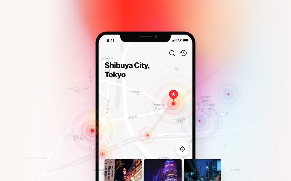
Service screen
It is a screen of different kinds of services, but using the same elements and components, each service is made to feel like a single product.